StackedBar (Component)
The StackedBar component takes an array of Points[] as points, a ChartBounds object, a colors array, a barOptions render prop to customize each stack segment, and some options for styling/animating, and returns a Skia Path element which draws the stacked bar chart.
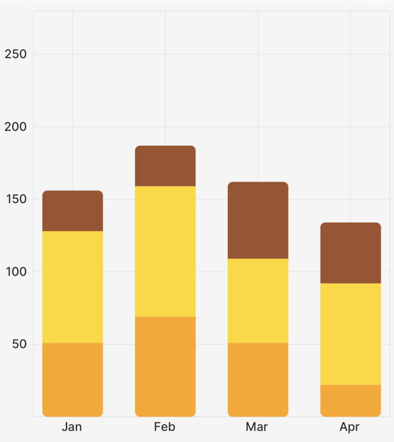
The example app inside this repo has a lot of examples of how to use the StackedBar chart and its associated components and props!
Example
import { CartesianChart, StackedBar } from "victory-native";

const DATA = (length: number = 10) =>
  Array.from({ length }, (_, index) => ({
    month: index + 1,
    listenCount: Math.floor(Math.random() * (100 - 50 + 1)) + 50,
    favouriteCount: Math.floor(Math.random() * (100 - 50 + 1)) + 20,
    sales: Math.floor(Math.random() * (100 - 50 + 1)) + 25,
  }));

export function MyChart() {
  const [data] = useState(DATA(4));
  return (
    <CartesianChart
      data={data} // 👈 specify your data
      xKey="month" // 👈 specify your x key
      yKeys={["listenCount", "favouriteCount", "sales"]} // 👈 specify *each* of your *yKeys* you wish to stack, the order matters here
      domainPadding={{ left: 50, right: 50, top: 30 }}
      domain={{ y: [0, 250] }} // 👈 you'll need to hardcode your y-domain (for now)
      axisOptions={{
        font,
        formatXLabel: (value) => {
          const date = new Date(2023, value - 1);
          return date.toLocaleString("default", { month: "short" });
        },
        lineColor: isDark ? "#71717a" : "#d4d4d8",
        labelColor: isDark ? appColors.text.dark : appColors.text.light,
      }}
      padding={5}
    >
      {({ points, chartBounds }) => {
        return (
          <StackedBar
            animate={{ type: "spring" }}
            innerPadding={innerPadding}
            chartBounds={chartBounds}
            points={[points.listenCount, points.favouriteCount, points.sales]} // 👈 the order here must match the order above
            colors={["orange", "gold", "sienna"]} // 👈 specify your colors
            barOptions={({ isBottom, isTop }) => {
              // 👇 customize each individual bar as desired
              return {
                roundedCorners: isTop
                  ? {
                      topLeft: roundedCorner,
                      topRight: roundedCorner,
                    }
                  : isBottom
                    ? {
                        bottomRight: roundedCorner,
                        bottomLeft: roundedCorner,
                      }
                    : undefined,
              };
            }}
          />
        );
      }}
    </CartesianChart>
  );
}
Props
points
An array of PointsArrays that comes from the fields of the points object, as illustrated in the example above. You need to specify each key; you can't just do points={[...points]}.
chartBounds
A ChartBounds object needed to appropriately draw the bars. This generally comes from the chartBounds render argument of CartesianChart.
innerPadding
An optional number between 0 and 1 that represents what fraction of the horizontal space between the first and last bars should be "white space". Defaults to 0.25. Use 0 for no gap between bars, and values closer to 1 to make bars increasingly narrow.
animate
The animate prop takes a PathAnimationConfig object and will animate the path when the points change.
colors
The colors prop takes an array of Color values to use for the bars. The order of the colors should match the order of the points prop.
barWidth
The barWidth prop takes a number and sets the width of the bar to that number. If not provided, the default is determined by the chartBounds and number of data points. Takes precedence over the barCount prop. Use this for the most fine grained control of bar width
barCount
The barCount prop takes a number and sets the width of the bar as if there were barCount x data points. If not provided, the default is determined by the chartBounds and number of data points. This is useful for keeping stacked bar widths stable when the visible data window changes.
barOptions
The barOptions prop is a render function with a signature like this:
type CustomizablePathProps = Partial<
  Pick<PathProps, "color" | "blendMode" | "opacity" | "antiAlias">
>;
barOptions?: ({
    columnIndex,
    rowIndex,
    isBottom,
    isTop,
    seriesIndex,
    datumIndex,
    isStart,
    isEnd,
  }: {
    isBottom: boolean;
    isTop: boolean;
    columnIndex: number;
    rowIndex: number;
    isStart: boolean;
    isEnd: boolean;
    seriesIndex: number;
    datumIndex: number;
  }) => CustomizablePathProps & {
    roundedCorners?: RoundedCorners;
    children?: React.ReactNode;
  };
This prop allows you to customize each individual segment in the stacked bar chart. seriesIndex and datumIndex identify the rendered series and datum; columnIndex and rowIndex are kept as backwards-compatible aliases for the same values. isStart identifies the segment closest to the baseline for that positive or negative stack, and isEnd identifies the outer visible end of that stack. isBottom and isTop remain available for vertical stacked bars and are derived from isStart/isEnd, including negative values. You can also customize the children of each segment, allowing for things like LinearGradients, etc. See the example repo for more information.
For stacked bars inside CartesianChart orientation="horizontal", use HorizontalStackedBar.