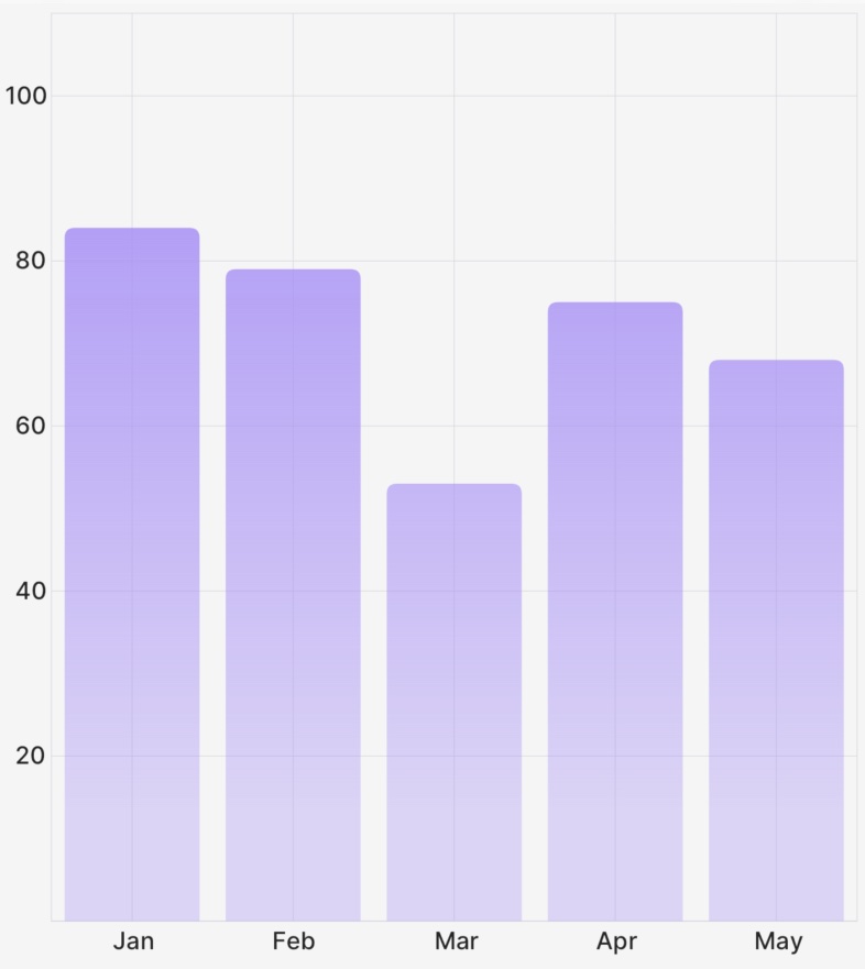
Bar (Component)
The Bar component takes a PointsArray prop, a ChartBounds object, as well as some options for styling/animating, and returns a Skia Path element to draw the bar chart.

Example
import { CartesianChart, Bar } from "victory-native";
import DATA from "./my-data";

export function MyChart() {
  return (
    <CartesianChart data={DATA} xKey="x" yKeys={["y"]}>
      {({ points, chartBounds }) => (
        //👇 pass a PointsArray to the Bar component, as well as options.
        <Bar
          points={points.y}
          chartBounds={chartBounds}
          color="red"
          roundedCorners={{ topLeft: 10, topRight: 10 }}
        />
      )}
    </CartesianChart>
  );
}
Props
points
A PointsArray array that comes from a field of the points object exposed the children render function of CartesianChart, as illustrated in the example above.
chartBounds
A ChartBounds object needed to appropriately draw the bars. This generally comes from the chartBounds render argument of CartesianChart.
innerPadding
An optional number between 0 and 1 that represents what fraction of the horizontal space between the first and last bars should be "white space". Defaults to 0.2. Use 0 for no gap between bars, and values closer to 1 to make bars increasingly narrow.
animate
The animate prop takes a PathAnimationConfig object and will animate the path when the points change.
roundedCorners
The roundedCorners prop allows you to customize the roundedness of each corner of the Bar component. It's an object type that defines the radii for the top-left, top-right, bottom-right, and bottom-left corners.
topLeft?: number: Defines the radius of the top-left corner of the Bar. If not provided, the default is 0 (no rounding).topRight?: number: Defines the radius of the top-right corner of the Bar. If not provided, the default is 0 (no rounding).bottomRight?: number: Defines the radius of the bottom-right corner of the Bar. If not provided, the default is 0 (no rounding).bottomLeft?: number: Defines the radius of the bottom-left corner of the Bar. If not provided, the default is 0 (no rounding).
barWidth
The barWidth prop takes a number and sets the width of the bar to that number. If not provided, the default is determined by the chartBounds and number of data points. Takes precedence over the barCount prop. Use this for the most fine grained control of bar width
barCount
The barCount prop takes a number and sets the width of the bar as if there X data points. If not provided, the default is determined by the chartBounds and number of data points. Useful for getting a fixed bar width regardless of the number of data points. Use this for a more general control of bar width.
labels
The labels prop allows you to enable and customize the data label of the Bar component. The data label text is the Y-axis value associated with the Bar component.
position: "top" | "bottom" | "left" | "right": Defines where the Bar component data label should be rendered in relationship to the rendered Bar component.font: SkFont | null: Defines the font to use with the SkiaTextcomponent.color?: Color: Defines the color the data label should be.
children
A children pass-thru that will be rendered inside of the Skia Path element, useful if you'd like to make e.g. a gradient path.
Paint properties
The Line component will also pass the following painting props down to the underlying Path component:
colorblendModeopacityantiAlias